The COVID dashboards, or why the simplest one won
In early 2020, the whole world woke up each morning asking the same question: "where do things stand with the epidemic?". Two sites set out to answer it. On one side, the Johns Hopkins University (JHU) dashboard: a prestigious university, leading scientists, the backing of major organizations and the media — Time magazine would go so far as to name the project's lead among the 100 most influential people in the world. On the other, Worldometer, a site with a pedigree so discreet that CNN called it a "mysterious website sowing confusion". Yet if you look at the numbers, the verdict is unambiguous: in April 2020, Worldometer became the 28th most visited site on the entire web, traffic multiplied by 370 in a year, and a tenfold gap with the JHU site. The general public — and some governments — chose the site without prestige. Why?
One question, one chart
What did Worldometer offer that was more? Nothing. That is precisely the point: they offered less. At the top of the page, a single chart — the number of daily cases since the start of the epidemic. It answers exactly the question the visitor came to ask: "where do we stand?". Colors are kept to a minimum, a touch of green for recoveries. Below it, a table by country that serves as both a measuring instrument and a navigation tool. Nothing clever, nothing spectacular — and nothing standing between the question and its answer.
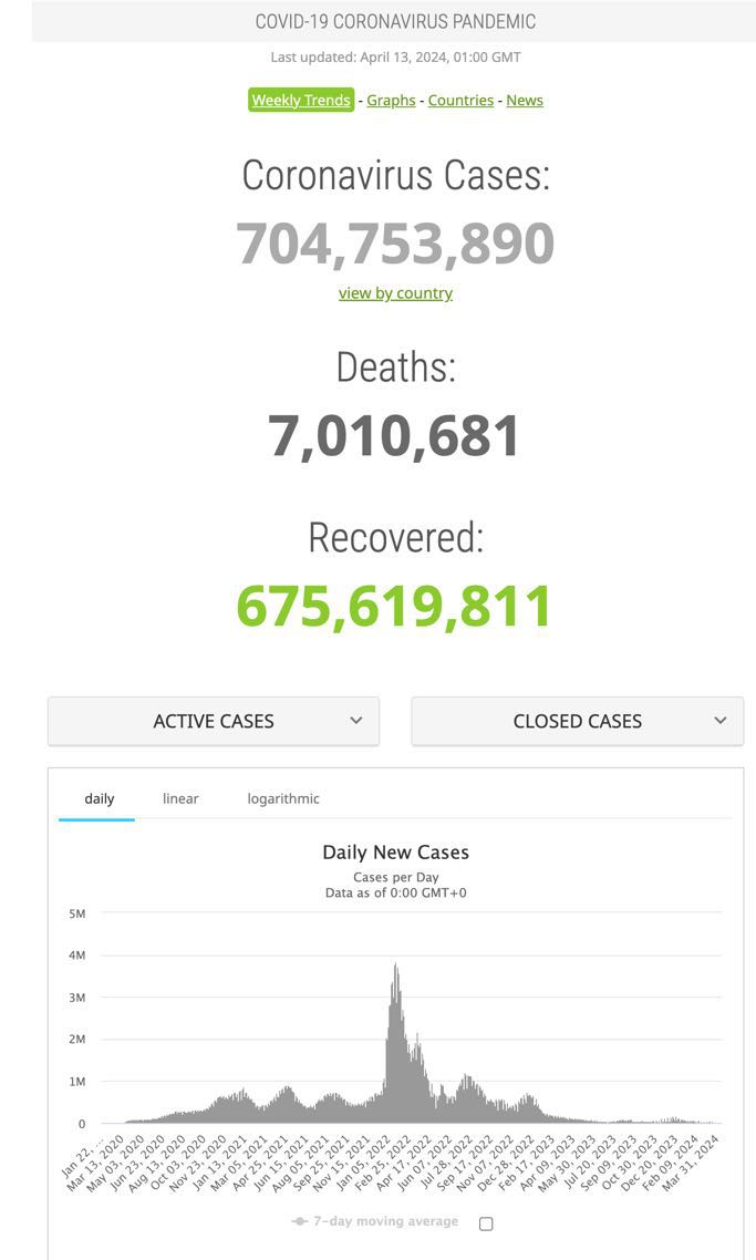
It is the same discipline as in any analysis: you start from a question, not from the available data. Worldometer built a page; JHU built a showcase.
A dashboard is not judged by what it shows, but by the question it answers.
The dashboard that tried to say too much
The JHU dashboard, for its part, displays three categories of data at the top, three more on the right, and two maps in the center. The information everyone comes looking for — how cases are evolving — is relegated to a corner, competing with vaccination tracking that would have deserved its own page. Three stacked charts carry three different colors and three different scales: 25 million cases, 120,000 deaths, 350 million doses. A factor of 3,000 between two neighboring curves — gymnastics the reader has to perform, or not. I would guess that roughly 99% of the people faced with such a heap of statistics do not really understand what they are being shown.
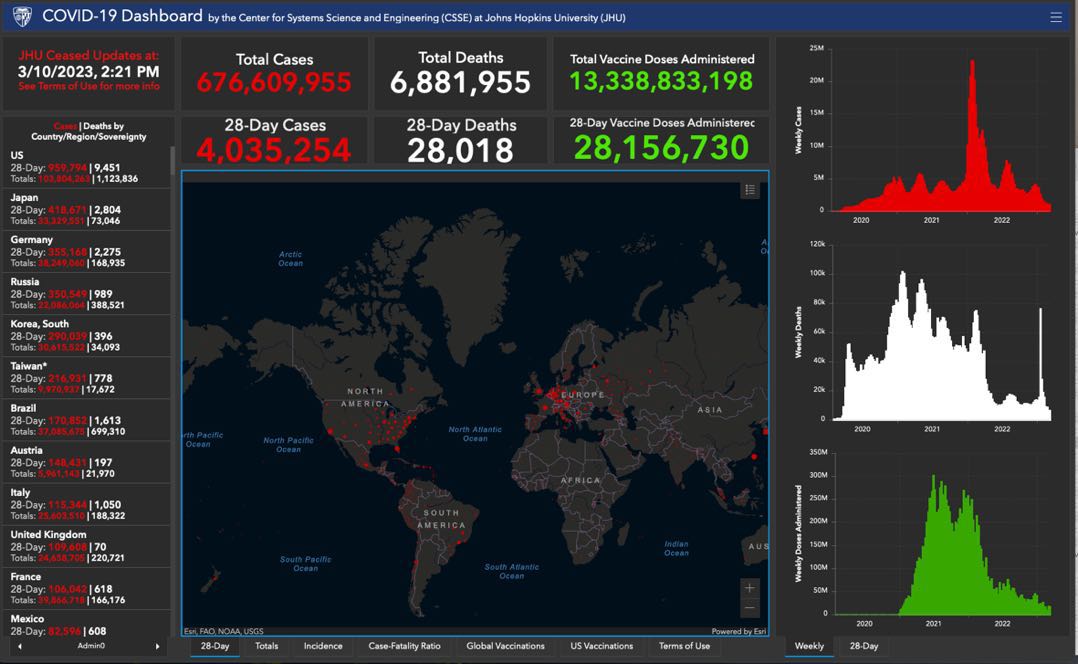
The colors tell the same confused, muddled story: red for cases, green for vaccinations, white for deaths. Beyond the fact that red and green swap meanings in some cultures, roughly 300 million people struggle to tell those two colors apart. As for white for deaths, it simply means nothing. When the use of color obeys no rule, it usually means no one stopped to ask the question.
Maps, or form over substance
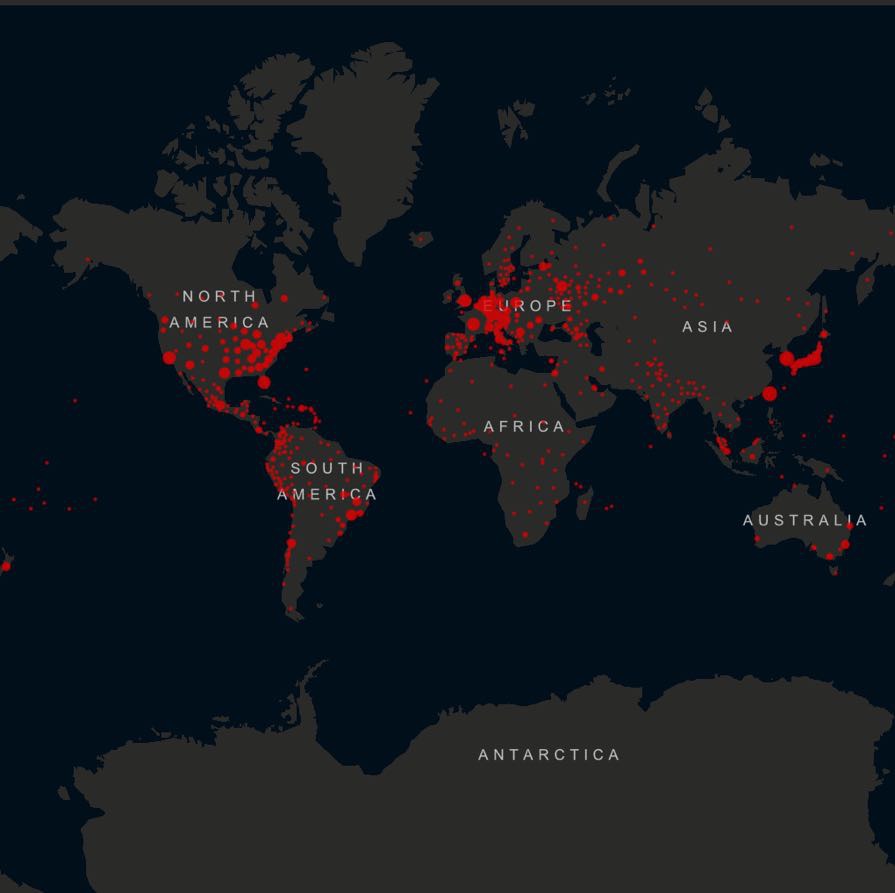
The most questionable choice sits in the center: the world map, served by default in Mercator projection. Greenland, Canada and Russia — about 2% of the world's population — occupy the top third of the screen, Antarctica the bottom third. Red dots pile up on it to the point of illegibility. And above all, a map is static: it says nothing about yesterday's situation or last month's, when the only question that matters is whether the epidemic is improving or getting worse.
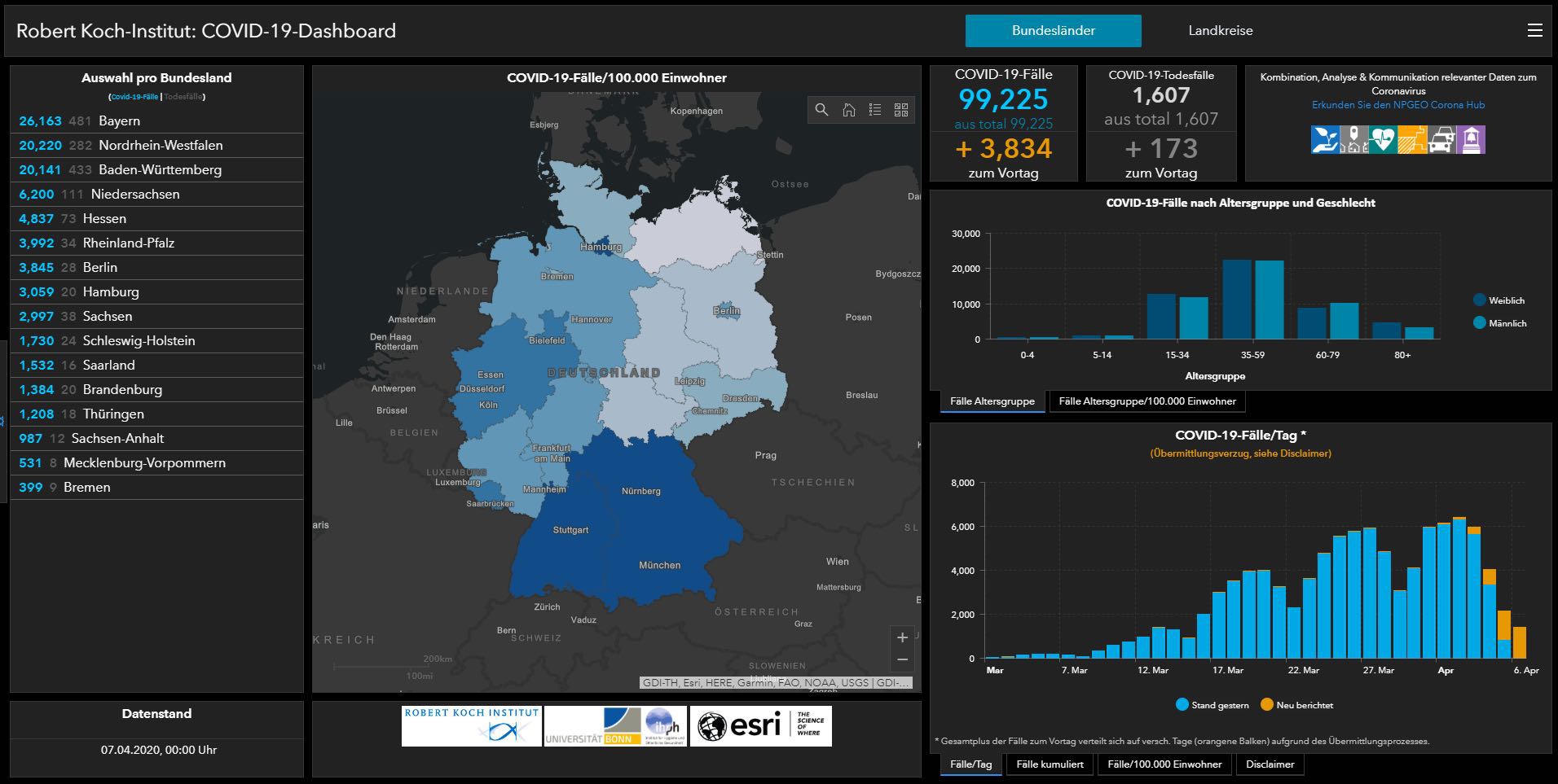
The argument is not that maps are always bad. The Robert Koch Institute, in Germany, made good use of one: a uniform administrative breakdown, few indicators, consistent colors — at the scale of a single country, the map works.
At the scale of the world, with entities ranging from the Vatican to Russia, it decorates more than it informs. The evolution of the JHU site is, in fact, an admission of failure: starting from a full-screen map in January 2020, it gradually moved away from the map to bring in… the bar chart. Without ever quite bringing itself to remove the maps.
Add the technical side: an interactive map is heavy, slow to load, and designed for a large screen — whereas in 2020, half of the world's web traffic was on mobile. Maps and small vertical screens do not necessarily get along. That is an understatement. Meanwhile, Worldometer's vertical page displayed the same way everywhere. Visitors wanted quick daily information. They had it.
The hidden battle: the data
One might be tempted to think Worldometer won through the chart. Not only that. Another decisive battle was being fought elsewhere, far from the screens: in collection. Official reports, press conferences, hospital bulletins, health-authority posts on social media — with no common definitions and no standard format. Worldometer compiled these sources by hand, continuously, from the very start of the pandemic. JHU eventually wrote scripts to scrape 400 sources every half hour, but started later — and while it was criticizing Worldometer's methods, it ended up using it as one of its own sources.
This is a near-constant of data work, and it is widely underestimated: the sources are heterogeneous, and processing them requires human judgments that no tool automates out of the box. We would no doubt like to believe that numbers can be "clean", and that a university team should have the upper hand in the battle of statistics. But there is no "clean" collection process — there are only choices, more or less well documented. The dashboard is merely the visible part; the quality of what it displays is decided upstream, in that thankless work.
What to take away
Simple, fluid technologies, backed by solid data processing, beat more complex and more spectacular tools. That is the lesson of COVID, and it holds for any corporate report: the overloaded dashboard that wants to say everything, like the average that summarizes too much, ends up saying nothing at all.
We applied these lessons to the letter when building our drug shortage tracking tool: one question — which drugs are in short supply, and since when? —, one page that answers it, and behind it the real work: collecting and shaping dispersed public data.
Next time someone presents you with a dashboard, do not ask what it can display. Ask what question it answers. If the answer does not appear within ten seconds, it means no one asked the question.
← All articles