On the art of analyzing data in Excel — or anywhere else
This is a series of articles about analyzing data in Excel. The goal is not to be exhaustive — hundreds of books already cover every Excel feature — nor to turn you into a data hero. The ambition is more modest: to arm you with the bare essentials for running simple data projects and to draw out the concepts shared by any analysis, from organizing the data to processing it, with a tool everyone already owns — Excel — to answer a question you are asking yourself.
You don't need a lot of data or tools. You need to answer a question
Sticking to a question is essential, because it is easy to get carried away by a dataset and the latest fashionable technology. The question may sharpen, or even evolve, along the way — but at the start, a problem to solve (however fuzzy, sometimes reduced to a single hypothesis) is the bare minimum.
I once explored a dataset of cars and studied the number of cars of each color. Then I built a distribution chart by color. Green cars were the most numerous. Utterly pointless. If, instead, I had postulated that white cars should dominate because they sell best in France, the analysis would have been much more interesting. The answer, instead of being as dull as possible, would have become surprising — and therefore worth investigating.
To answer a question, you should use the minimum data necessary. No need to chase hundreds of millions of data points if a hundred are enough to answer your question.
Say you manage a municipal swimming pool, and your manager asks you to forecast attendance peaks. The ideal culprit turns up fast: the outside temperature — the hotter it gets, the more people show up. You pull four years of ticket sales, a small linear regression links attendance to temperature, and bingo: the curve predicts 93 % of the peaks. It took just 365 × 4 + 1 rows (the leap year) to solve the problem.
The question now becomes: is this enough, or do you need to keep going? Your manager may be satisfied. Or perhaps disappointed. He did not need you to know that most attendance peaks happen on very hot days. Still, someone had to prove it. Perhaps that 93 % is not good enough and you need to investigate what lies behind the remaining gaps. And four years of cash-register data may no longer be enough to answer your questions.
This little example reveals the very down-to-earth problems hiding behind big words like data or machine learning (linear regression is, after all, a basic one). The reality is usually far less esoteric than it sounds. And if a piece of paper and a pencil are all you need to solve your problem, by all means use them.
Why Excel?
Is Excel still relevant today? You have surely heard of Looker Studio, Tableau or, within Microsoft, Power BI — and their marketing teams have done a fine job of pushing Excel into the background. But that would be forgetting that these tools occupy a different place on the data chessboard.
Every piece of software or programming language is just a tool, suited to certain situations. Looker/Data Studio, for instance, is built on Google Analytics, itself built on website traffic data — so it is a tool designed around analyzing that. Power BI has clear advantages for sharing the visuals you produce, but setting it up remains heavy. Python is a fine language for math and analytical models, but for everything else I prefer working with Javascript and its quirks.
Projects involving relational databases or analytics with a tool like Looker or Power BI are heavier to set up. Excel is faster and more flexible, and gives you a transversal view of every step of an analysis or reporting project. The spreadsheet, whose ancestors date back to the 1960s, feels natural to us: true 50 years ago, it will likely still be true in 50 years.
Excel's strengths
- Excel is available everywhere; everyone knows it and knows how to use it, for better or for worse.
- An Excel project is quick to set up. Some problems do not require astronomical amounts of data to be solved, and a quick analysis in Excel is often enough.
- Excel covers the whole data spectrum: storage, organization, analytics (descriptive, diagnostic, predictive, prescriptive) and visualization. It also lets us manipulate each of these elements directly.
- Its tools are generally more flexible, particularly for visualization.
- With hundreds of millions of users behind it, Excel keeps evolving and integrating ever more tools (Power Query, and now Python right inside the workbook).
Excel's weaknesses
- You cannot work with large data volumes if you confine yourself to an Excel file for storage. That limitation disappears once you connect to an external data source.
- Automating and refreshing reports and visuals requires careful setup — read: it is easy to break an Excel report during an update.
- File sharing and protection features are clunky add-ons; tools like Power BI are often better suited for sharing reports with outside parties.
In short, Excel lets you see every element of data processing in a single piece of software: storage, organization, analytics and visualization. There is very little abstraction in Excel, which makes it an interesting tool for beginners — and sometimes for going further too.
Data with data, analysis with analysis
As soon as a project outgrows a single worksheet, you have to organize your tabs and files and separate the purpose of each. It is like cooking. Alone, you can eat in the kitchen or on the couch — it does not matter. With guests, you peel the vegetables in the kitchen and serve in the living room — not the other way around. And to cater a banquet for 100, you need a team and a well-oiled organization. Data analysis is exactly the same.
A place for everything and everything in its place.
More generally, we speak of separation of concerns. The concept comes from programming, but it holds for many other fields — architecture, cooking, politics and its separation of powers. Everything has its place.
In data work, separate the data, its analysis and its presentation, and make clear — to yourself and to your stakeholders — which tab or file does what. The bigger the project, the more this matters: mixing analysis and data quickly exposes you to maintenance problems. I would even say that being able to tell an analysis table from a data table is already real data literacy.
Naming your folders, files and tabs consistently
Separation of concerns is all well and good; let's see how it plays out in practice, by giving names to our folders, files and tabs.
Here are some of the naming elements we can use:
- A prefix: I use ASCII alphabetical order to sort the elements of a folder. Files prefixed with "00" will sit at the top of the file listing. I reserve "zz" for archive files, which end up sorted last.
- The project or analysis name: when there are several analyses or projects. When a file mixes several projects together, we identify them. A typical example is a financial reporting file with a "Revenue" report and an "Inventory" report.
- The purpose of the file: "DATA" for data storage, "ANALYSIS" for... analysis and charts, "CONSO" for data consolidation, "CLEAN" for cleaning.
- The date (Year_Month_Day): a classic among classics, dating your files. No explanation needed, except that the "YYYY_MM_DD" format is wiser because it sorts same-named files chronologically. If the day comes first, files get sorted by... day of the month first, then month and year.
- The version: an alternative to dating files is using file versions — "V1", "version_2",...
You can of course mix these elements as you wish and even — let's go wild — invent your own. Now for a few examples.
For a financial reporting file, we can use a sorting prefix followed by a purpose label and the date. A folder might gather the following files:
- "00_DATA_Finance_2023_03_01"
- "01_REPORT_Finance_2023_05_01"
- "zz_DATA_Financial_report_2023_01_01"
- "zz_DATA_Financial_report_2023_02_01"
- "zz_DATA_Financial_report_draft_2023_01_01"
For a simple analysis with data and analysis in the same file, we would probably not need the date, nor a prefix to order the tabs — giving us an everyday file with one "DATA" tab and one "ANALYSIS" tab.
Finally, here is a real example of a sales reporting file structure:
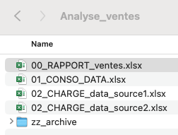
When I open the folder, I immediately see the important file at the top; most colleagues will only ever open the "00_RAPPORT_ventes" file anyway. The two "02" files load data from two different sources with Power Query. Then, still with Power Query, I tap into those two files to consolidate and transform the data into the "01_CONSO" file, and the "00_RAPPORT" file taps into that one to feed itself with data.
← All articles